

Digital Marketing Solutions

Call Us For Query
262-402-3322
Email Anytime
Info@rkldigital.com
Visit Our Office
17145 W Bluemound Rd, Brookfield, WI 53051
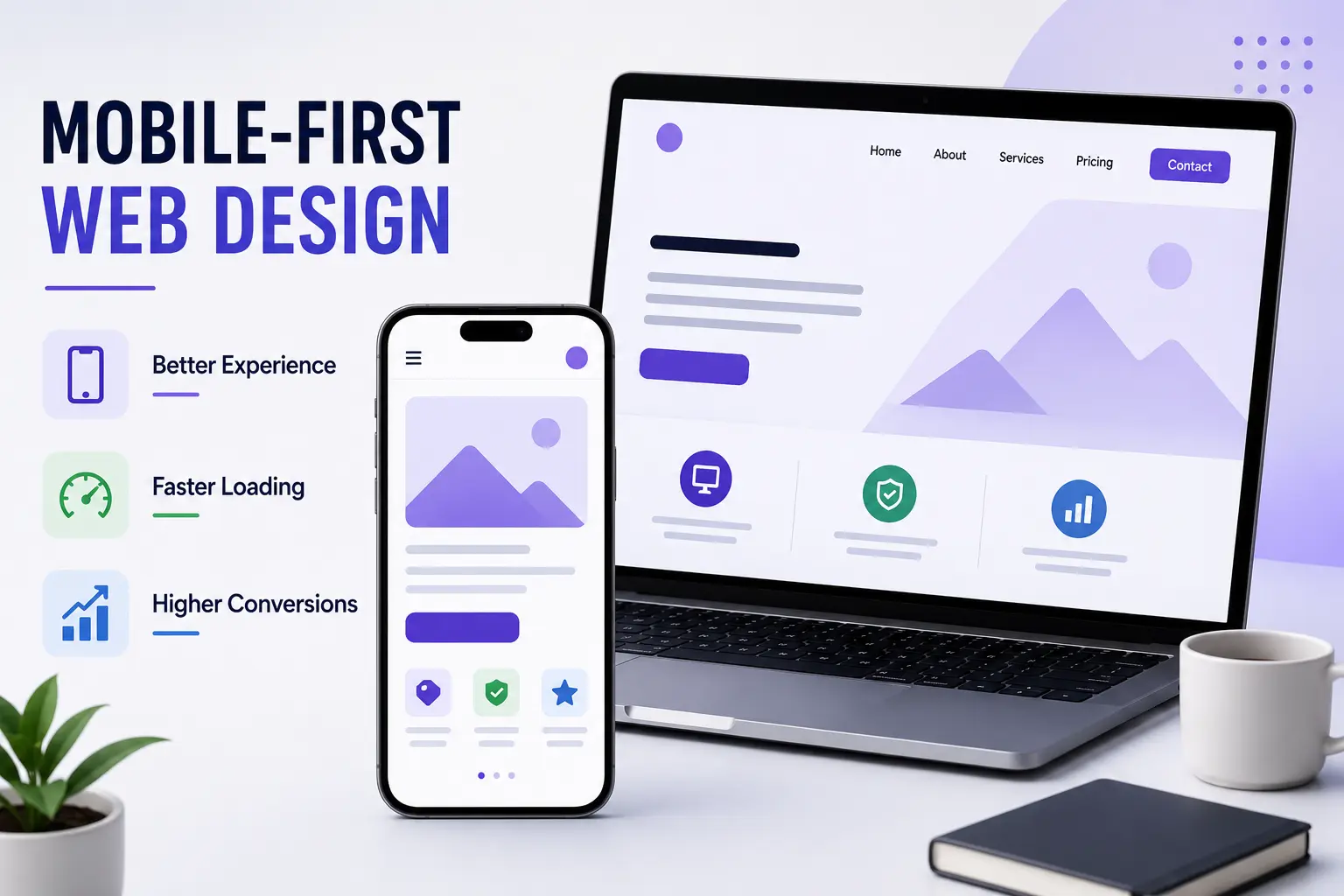
Mobile-first web design prioritizes smartphone users by creating fast, responsive, and easy-to-navigate experiences. With more people browsing on mobile devices, businesses can improve engagement and accessibility by designing for smaller screens first.
Touch-friendly layouts, readable content, fast loading times, and simple navigation help users interact smoothly across devices. A strong mobile experience builds trust, improves satisfaction, and supports higher conversions.
Mobile-first design improves usability, engagement, and conversions across devices. Team RKL Web Design Experts
Mobile-friendly layouts, fast loading, and simple navigation help businesses deliver smooth experiences and improve customer engagement.


Touch-friendly layouts, readable content, and simple navigation make websites easier to use on smartphones and tablets.
Optimized images, fast loading times, and responsive interfaces create smoother mobile experiences, helping businesses improve engagement, trust, and conversions.


03 Comments
15 Jun, 2024
Michael Turner
Designing for mobile first helped us create a much cleaner experience across all screen sizes.
15 Jun, 2024
Sarah Bennett
The mobile-first approach made navigation easier and significantly improved the user experience on smaller screens.
15 Jun, 2024
David Roberts
Starting with the mobile layout helped us prioritize important content and deliver a faster, more responsive website.
Leave a Reply